“Color is a power that directly influences the soul," said painter Kandinsky. Indeed, colors in the office are consequential. Just one forest green accent wall in the right space can add to the collective sense of health due to color’s visceral, instant influence. Let’s explore this power!
Color psychology is the study of how different colors affect humans in different ways. This stems from the fact that every color is a measurable frequency with a measurable impact. Red is generally stimulating while blue is generally sedating, for instance. Yellow generally inspires new thought patterns while gray communicates professionalism, instilling trust in clients. And so on.
Color choices are imperative in the office because humans are sensory creatures. When we enter a space, we process the space’s colors, first, forming our initial impression based on this element. While white work rooms can cause tiredness, harming productivity, blue is generally an excellent choice for steadily powered performance.
The interior upholstery panels in our Hushoffice collection of acoustic work and team meeting booths are available in a selection of terrific colors. Additionally, they feature user-adjusted lights and ventilation. Personalized and adjusted to individual taste and comfort levels, a Hushoffice booth is the best place in the office for its devoted task.
Color psychology. Different hues influence us in different ways.
Color psychology explores how colors affect human behavior, emotions, and mental processes. The field combines elements of neuroscience, design, marketing, and aesthetics to understand the many ways different tones influence people. It’s a study in the wonder of color.
Marketers use color to guide consumer behavior. Designers, architects, and planners build environments that promote health and concentration thanks to a solid understanding of how colors touch people. Certain color temperatures can even affect a person’s physiological responses. This phenomenon is applied carefully in healthcare settings to create healing spaces. In schools, colors can literally color learning outcomes, impacting student attention, motivation, and memory. Going about your day with more mindfulness, you may begin to appreciate just how promptly and deeply colors impact you, whether an obnoxiously bright red space divider causes a headache or a muted celadon wall imparts a feeling of ease
Color brings a complex mix of psychological and physiological factors into play.
It evokes feelings and associations per learned cultural meanings. It influences arousal levels, activating the sympathetic or parasympathetic nervous system. In choice combinations, colors also give a space harmony or discordance, forming mood through visual balance and contrast.
Colors speak louder (and more quickly) than words.
People form unconscious judgments about a space within 90 seconds of entering it. 62%-90% of this judgment is color-based, alone. Indeed, when you enter an office, your brain processes its colors first. So we navigate the world through tones, through the felt signals and information tones convey.
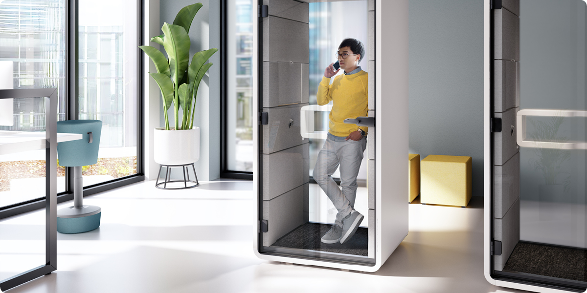
HushPhone is a secure call booth with a professional look. Inside, employees can talk over sensitive matters with total confidence.
Every color has its own wavelength and vibration.
These measurable wavelengths create real electrical impulses, influencing the human body and mind. So being in the mere presence of a given hue can change the way one thinks and feels. A color can affect neurological pathways or create a biochemical response.
Color choices in the office matter for a multitude of reasons.
Colors mold employee cognition. They can better or worsen a team’s overall attitude toward the moment’s task. They can add to or detract from a group’s sense of healthfulness. And most simply, they can make the office a breeze or a trouble to navigate.
Productivity. Working in a red chromatic atmosphere is shown to improve focus on Cartesian thought processes. A blue chromatic atmosphere, on the other hand, is better suited for creative work. With attentiveness and a little experimentation, colors can be consciously employed to foster concentration on every office zone’s specific type of task.
Mood. Tones literally set the tone for a work setting’s activities. Blue, for example, has long been heralded as calming. The parasympathetic nervous system is in fact engaged by cold colors: blues, purples, grays. Blue can thus elicit stress relief in the office by stimulating our “rest and digest” mode, reducing blood pressure and heart rate all the while, furthering relaxing employees.
Branding. Color can play an awesome role in reflecting and reinforcing a company’s image. To project stability and professionalism, gray may be artfully placed in visitor spaces. To show devotion to employee health, sunny yellow may be employed in a workplace’s social hubs.
Wayfinding. Using different colors for distinct zones in the office can help people navigate the space fluidly. Clear wayfinding is especially crucial for neurodivergent employees. It reduces the anxiety, confusion, and sensory overload that goes with chaotic environments. Follow the “yellow brick road” of universal office design by placing colors carefully throughout your office for intuitive navigation.
Well-being. Pink is a color proven to reduce aggression. Its use in the office can help to alleviate tension, allowing for everyone’s more grounded and peaceful frame of mind. Moreover, color therapy, or the use of specific colors to heal, is a legitimate practice! For proven stress and anxiety reduction benefits, you may consider surveying your team to learn which colors they find most soothing.
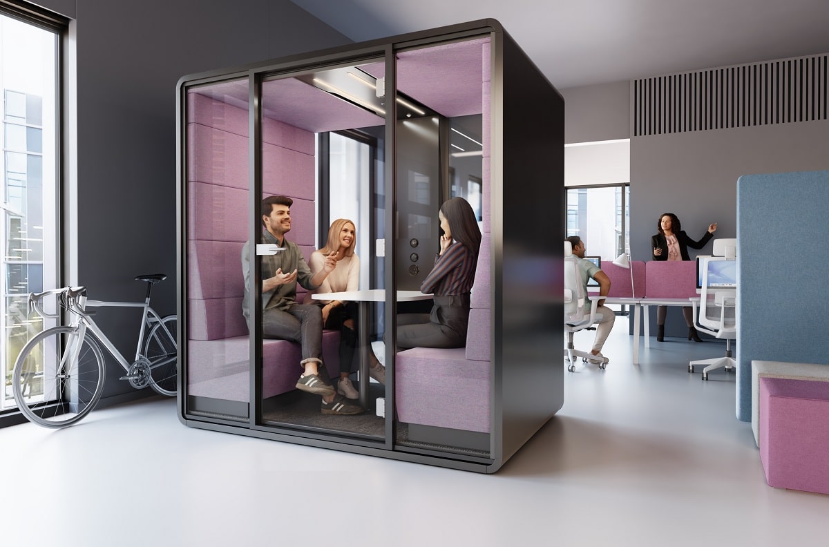
The hushMeet quiet office pod for hybrid team meetings.
The reason color is such a terrific catalyst in the office is that, unlike words or mere value statements, color is physical. It has a physical impact on our body and mind as soon as it hits our eyes. Every color is, after all, a discrete frequency. So, in a way, color has the capacity to bypass our elaborate cognition entirely by its immediate, visceral impact. While verbal commitments to your team’s work-life balance take time to realize, for instance, painting the work lounge in a deep, beautiful royal blue actually makes people feel at ease at once
Inspiration time. The Hushoffice office pod upholstery color palette sings.
Look around. Feel the impact of color. It’s undeniable. Not just a detail, but a communicator. Its language transcends words, shaping our thoughts and feelings through sensory input alone. With this in mind, let’s take a look at the few available colors for our Hushoffice acoustic pod collection.
Generally, a yellow or red will be a spectacular choice for lively teamwork. Wherever stress relief is concerned, you might consider opting for a more subdued color — a blue or green that is lightly energized while grounding. And for independent focus, a warm and welcoming orange that doesn’t overpower will do well for your employees
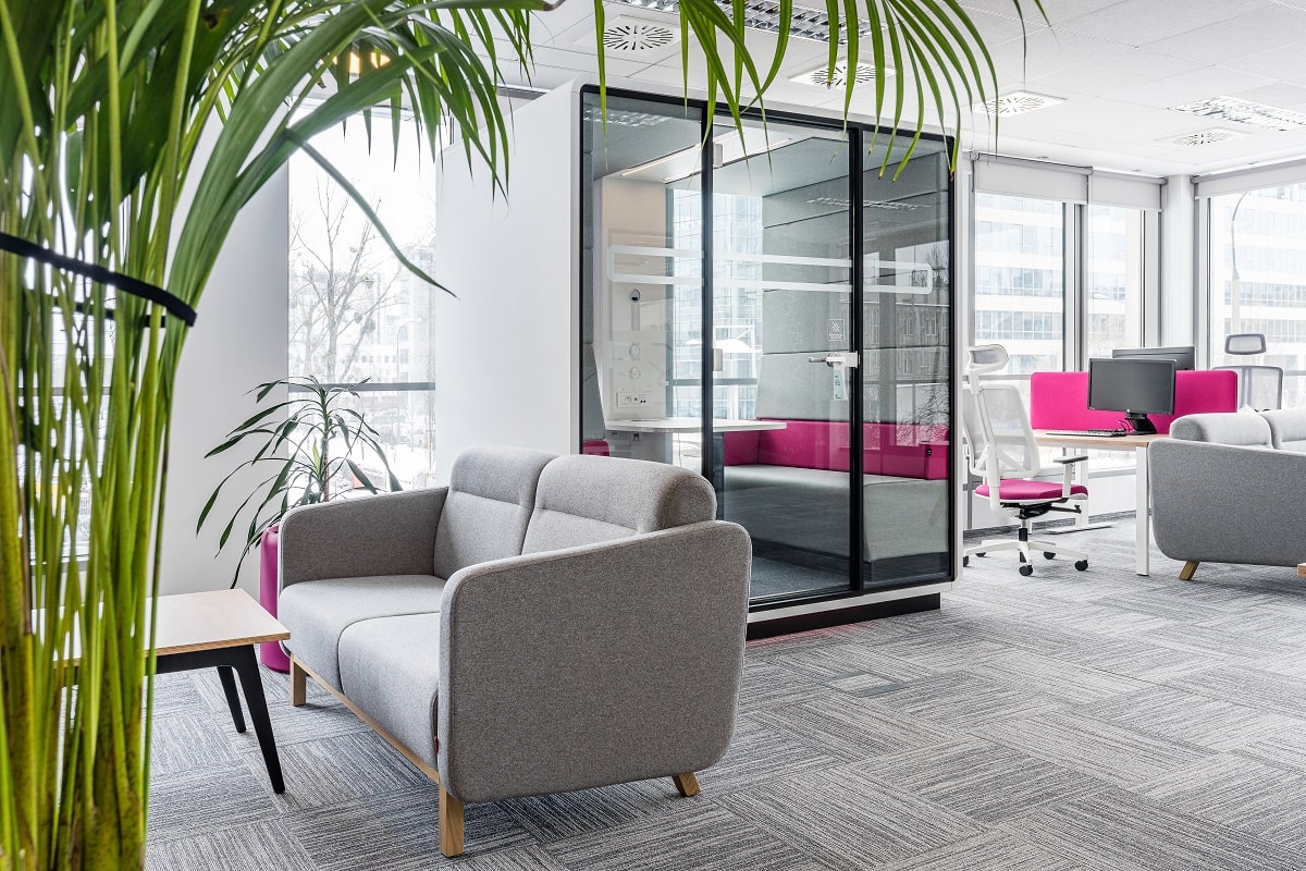
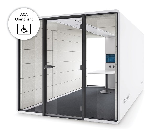
Halfway between white and black, gray is impartial. It speaks neutrality. Its unemotional character gives sophistication that emphasizes the intellect. Often projecting modernity and tech-forwardness, gray is a great choice for a professional meeting space like hushAccess.L.
HushAccess.L is a large conference pod adapted to the needs of wheelchair users.
Beige. Biophilic and easy on the eyes.
Softer and friendlier than white, beige is a popular pick for good reason. From the French word for ‘natural wool,’ this hue has an organic feel. Its connotation as “bland” works to your advantage wherever a calm, certain atmosphere is needed — perhaps in a relaxation booth like hushHybrid.
Orange. Warm, familiar, and happy.
Warm colors like orange are proven to increase attentiveness to learning materials compared to cold colors. This beneficial aspect makes orange a smart option for a project group space where in-depth presentations are typical.
Red. Invigorating. Passionate.
Associated with power, red is a super stimulating color ideal for busy, bustling work areas. Red can thus boost performance on tasks that require detailed attention, so it may be a smart choice for a benching station or team work booth like hushMeet, when vigorous collaboration is needed.
Blue. The dependable hue. A go-to.
Blue may be the ultimate color for balanced focus in the workplace. It is especially beneficial for those who perform at a fast pace. Soothing yet conducive to concentration, it is an apt choice for a private work booth like hushHybrid.
Yellow. Sunny and lovely.
The color of sunshine and cheer, yellow is one with enthusiasm, helping people open up and collaborate. Its bright cheeriness is well-suited for social work spaces in the office, whether it be a cafe or a break room booth like hushAccess.L needing a pop of sunshine.
Green. Natural healing.
Just seeing green boosts concentration. Evocative of nature, it is indeed one of the most revitalizing colors to bring to the workplace. It can freshen thought by giving it new oomph. As such, it is a tone to harmonize the office, correlated to broader thinking, and associated with renewal.
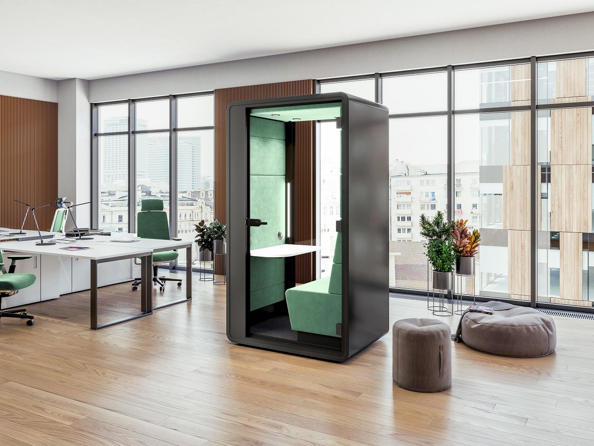
Quiet pods for offices like hushHybrid are sanctuaries of focus within a bustling (perhaps dog-filled) office.
A Hushoffice booth, the perfect, personalized atmosphere for any task?
Hushoffice work booths feature fine-tunable lights and ventilation, letting you tweak their interior to satisfaction. Moreover, their premium upholstery is available in many high-quality colors. When you set foot in a hushFree booth, you enter the best possible environment for the task at hand.
The power of colors in the workplace – summarized
Color psychology is the study of how different colors affect humans in different ways. This stems from the fact that every color is a measurable frequency with a measurable impact. Red is generally stimulating while blue is generally sedating, for instance. Yellow generally inspires new thought patterns while gray communicates professionalism, instilling trust in clients. And so on.
Color choices are imperative in the office because humans are sensory creatures. When we enter a space, we process the space’s colors, first, forming our initial impression based on this element. While white work rooms can cause tiredness, harming productivity, blue is generally an excellent choice for steadily powered performance.
The interior upholstery panels in our Hushoffice collection of acoustic work and team meeting booths are available in a selection of terrific colors. Additionally, they feature user-adjusted lights and ventilation. Personalized and adjusted to individual taste and comfort levels, a Hushoffice booth is the best place in the office for its devoted task.
Colors in the office – frequently asked questions
What is color psychology for employees?
Color psychology recognizes the subconscious impact colors have on employee mood and productivity. It offers a framework that is helpful in addressing the cultural and individual differences in color perception. As such, a good understanding of color psychology can ensure that chosen colors resonate with and work for most employees on a personal level.
What color is calming for an office?
Blue is one of the most relaxing colors to feature in a workplace. Consider finishing your Hushoffice booth’s interior upholstery in a blue tone to make it a haven of rest or peaceful focus.
What is the best color focus productivity?
While red is shown to improve focus on Cartesian thought processes, blue is more suitable for creative tasks. Moreover, green may be the best choice for work involving broader thinking.
Why human-centric office design? Human-centric design recognizes that the office is an ecosystem by putting employees at the heart of every decision made about its shape, sound, and feel.
Why create an inclusive workplace? Inclusivity is a big topic in today’s work landscape. What does it really mean? How can the office’s design support it?
An office that motivates is an office that’s human Ambition happens in spaces that breathe with the rhythms of work and rest. The office is an active participant, shaping this ephemeral thing called motivation.